While the native tools in DartCannon provide a powerful view into your simulations, if you want to perform your own analysis or create a custom chart, you'll want to use the Excel Export feature.
Excel Import/Export is a pro feature which requires a paid subscription. Sign Up Now!
Getting Started
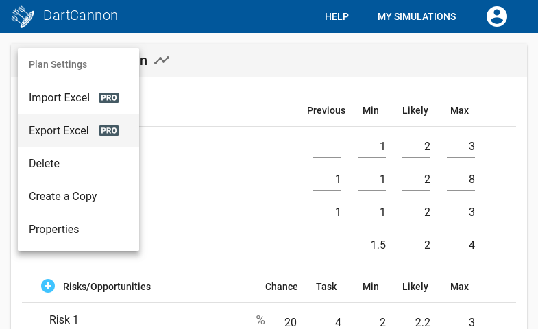
Exporting an Excel file is as easy as clicking 'Export Excel' from the Simulation menu.
The resulting XLSX will contain the following worksheets:
- Introduction
- Items (for budgets) or Tasks (for plans)
- Risks
- Simulation Results
- Result Ranges & Probabilities
- Critical Paths (only for plans)
Creating a Custom Chart
Lets use this to create a version of the normal results chart, only with a different color scheme. We'll use the 'Holiday Presents' simulation created in the Getting Started guide.
First, we'll go to the 'Simulation Results' worksheet which contains the 'raw' output of the simulation. There are three columns here -
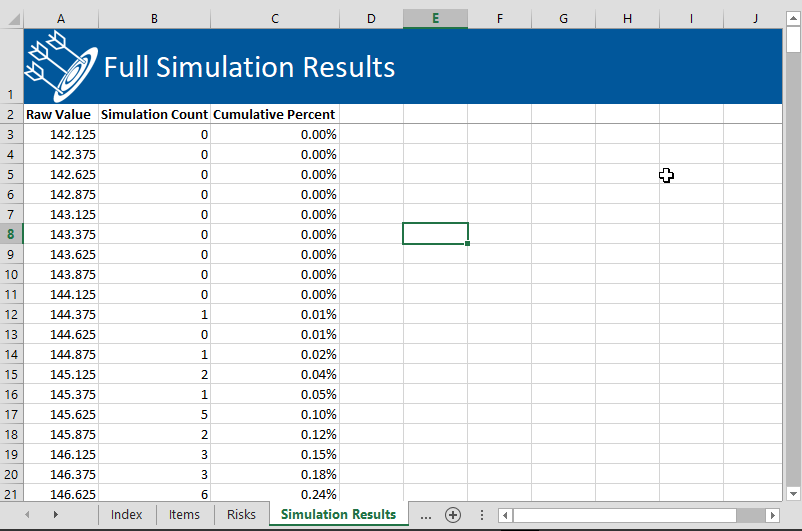
- Raw Value- this is the value
- Simulation Count - the histogram, or number of times this particular value was simulated
- Cumulative Percent - the running percentage.
There is far more resolution in this export than displayed online where data is further binned depending on the display. Here, the data is at the maximum resolution.
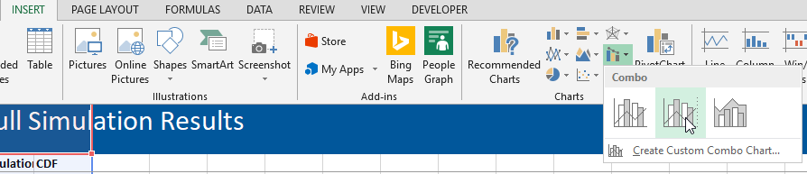
This makes it easy to create a new chart. We select our three columns, then go to 'Insert' and select a 'Combo Chart' which will put our results on separate axes.
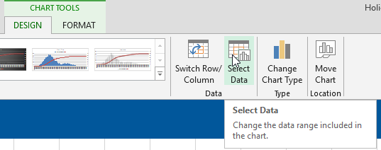
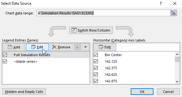
Before we look at the chart, we need to dive in and remove the first row from the datasets - go to 'Select Data' under 'Design' in 'Chart Tools':
Then edit each of the series to set the label to the second cell and the range starting at row 3:

The default chart isn't bad, but we can clean it up a lot:
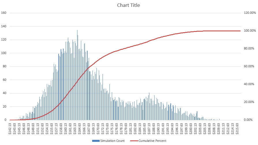
While not an Excel tutorial, there is one tip that can be hard to find. If you want your bars to fill the space completely without gaps, you want to change the following settings:

- Set 'Series Overlap' to '100%'
- Set 'Gap Width' to '0%'
By making that change, tweaking colors, adding labels and a callout for the most likely outcome, we end up with the following:
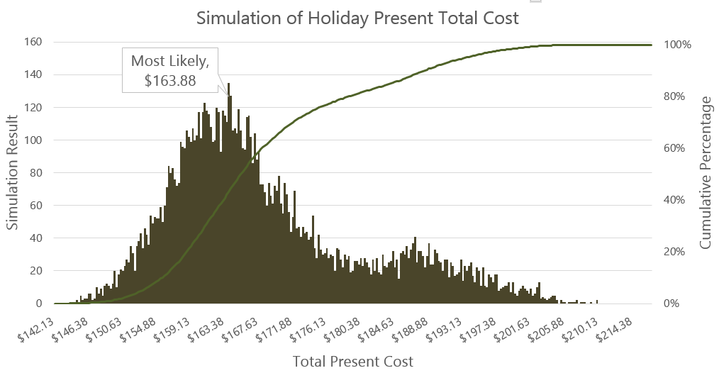
Not too shabby and far more personalized than the default chart.
Final Notes
We've only scratched the surface of what is possible once you have the raw data in hand - hopefully it inspires you.
It is important to note that the export is "static" - changing the estimates in the excel will not change the results. Because the output is based on the last simulation run on DartCannon, it is suggested you increase the number of runs to the maximum before exporting for best results.
For more information on the Excel Import/Export feature, check out the help page in our documentation.